Fred and Mira Lee had been married less than two weeks when they made what Mira refers to as “an unholy vow” to open a brewery in Columbus, Ohio. “I think there was a literal spit handshake,” jokes Mira as she reflects back on the challenge the couple set for themselves a little over five years ago. The pair were already accomplished homebrewers by that time, and had assembled a pilot brewing system nicknamed Amelia Beerhart in their garage, complete with a “surprisingly legit” analysis lab. In fact, when they decided to go pro, they started out doing yeast propagation and lab services for other breweries before brewing themselves. Actual Brewing began production in 2013, but they still offer lab services under the side business Hoax Labs.
The pair’s meticulous laboratory background is reflected in Actual Brewing’s motto: “Brewed with tender loving science.” That TLS gets applied to a wide range of styles, including a light lager, an imperial stout, an abbey ale, and many others, and they have plans to play with sour styles in the future. While there is no consistent style family that defines Actual Brewing, what is consistent is an emphasis on balance and precision.
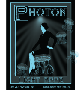
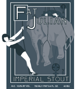
Actual’s motto also shows off their impish and whimsical sense of humor and style, which are best illustrated by the brewery’s gorgeous labels, which Mira designs herself in Adobe Illustrator.
“We’d originally intended to contract someone to handle our labels, and we talked to a couple wonderfully talented local artists,” says Mira. “But we were still brand new, and we needed so much design work done, and we couldn’t really afford what we wanted. Fred kept saying that we’d be more agile and consistent if we handled the art internally.”
Mira didn’t have a background in art or design, but you’d never know it from looking at the results of her efforts.
“I’m hardly trying to market a product so much as I’m just playing around with ideas that amuse me,” says Mira. “The lack of checks and balances is a dangerous luxury. It allows me to be foolish and whimsical where such risks might normally get weeded out of the design process.”
Mira Lee is selling herself short. While “whimsical” certainly fits these labels, they show a cleanliness and consistency that should be the envy of many professional designers. There is both exuberance and restraint at work in these designs that incorporate several schools of art and a diverse but cohesive array of thematic influences. Elements of science fiction and steampunk, fairy tales, old carnival and circus posters, and turn of the century advertising art are all reflected on Actual Brewing’s bottles.
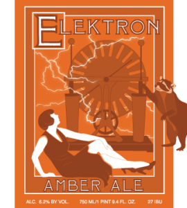
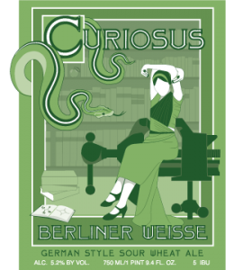
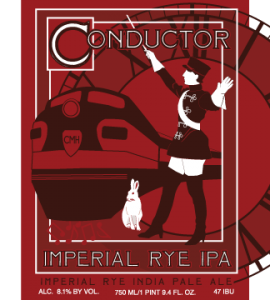
“The overall style of the labels is inspired by illuminated manuscripts, with the drop caps and the imagery overspilling the margins,” explain Mira. “But I simplify it into a vaguely art deco letterpress style that doesn’t take itself quite so seriously.”
“Like a pop-up book about a scientist who fell asleep on her lunch break and dreamt she was Queen of the Zoo,” she reflects with the same clever whimsy of her visual creations.
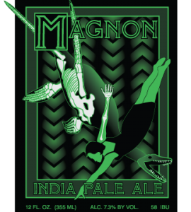
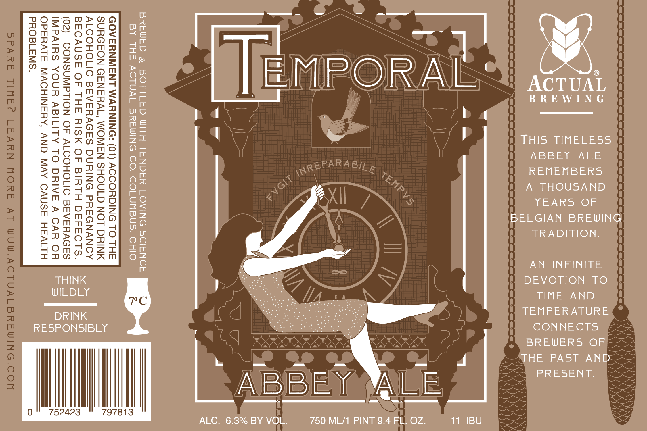
Mira gives us a peek inside her creative process for naming and illustrating a particular beer label with this explanation of Actual’s Temporal Abbey Ale:
“Every label starts with the beer. I talk to the brewers about the recipe, do some research about the style and the ingredients, and then I start with one bad joke. Everything else blooms out from there. As an example, we brewed an abbey ale—not flashy, not sexy, but very precise, a traditional style. My original bad joke was to give an abbey ale a distinctly secular name: Temporal Abbey Ale. But ‘temporal’ has two meanings: ‘relating to worldly rather than spiritual affairs’ and ‘relating to time.’ And time is one of the most important factors in brewing, so I quickly veered in that direction. Each of our labels features an animal, so in this case I chose the cuckoo bird, native to the cuckoo clock, which is essentially just a tiny temple to time. The monochromatic brown color palette required a lot of texture, detail, and reflectivity to draw the eye. I began with traditional cuckoo clock shapes, gave them a homespun texture inspired by monk’s robes, and added some symbolic detailing like a row of tiny hourglasses and a somber latin admonishment. Our comedian friend Amber posed for this one, and she’s holding back the minute hand while wearing a party dress that’s precisely sparkled with the National Park Service’s cartographical pattern for ‘shifting sands.’”
The level of attention to detail that goes into this one label design, and the skill with which the vision is carried out, is echoed in Actual’s precise brewing process. Between what’s in Actual Brewing’s bottles and what’s on them, you’re in good hands with Fred and Mira Lee’s tender loving science.